Branding materials
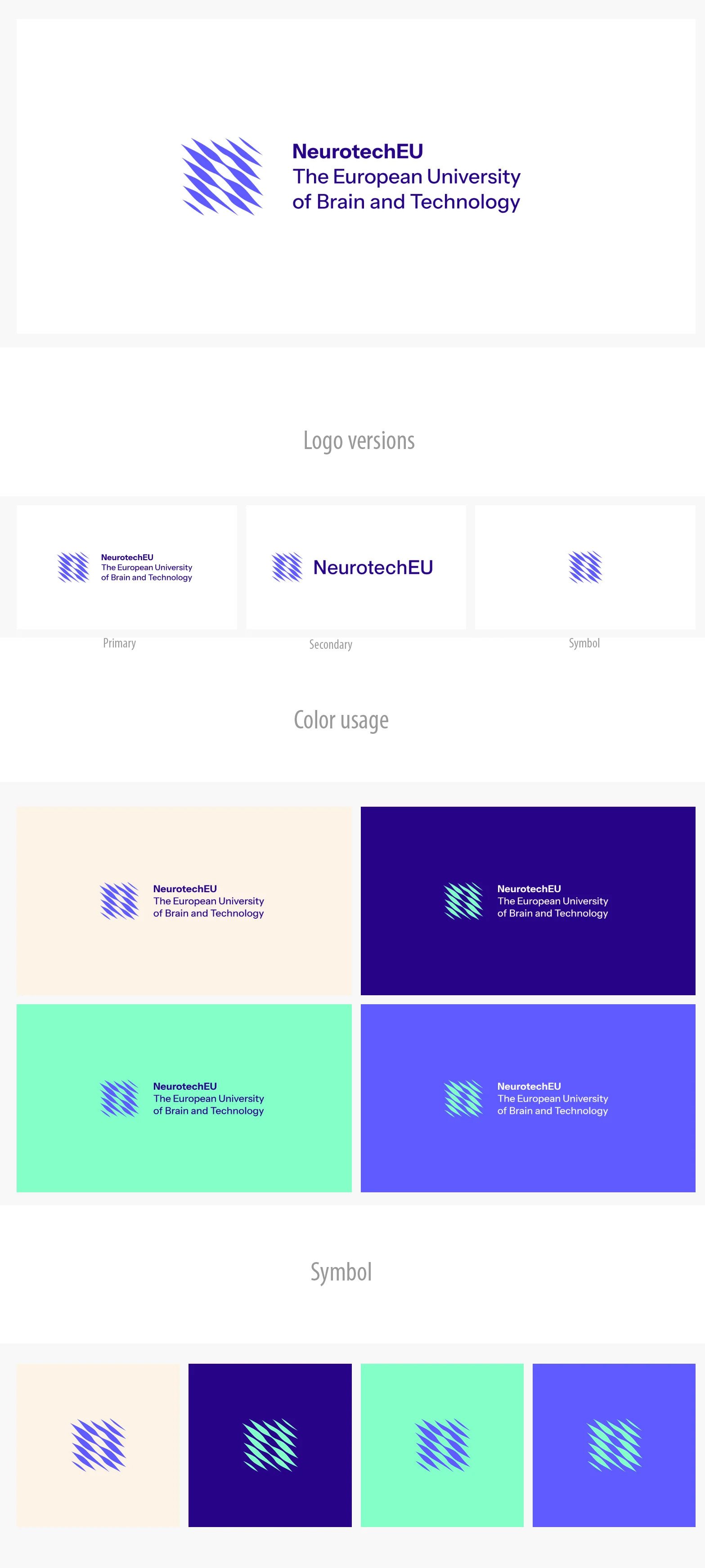
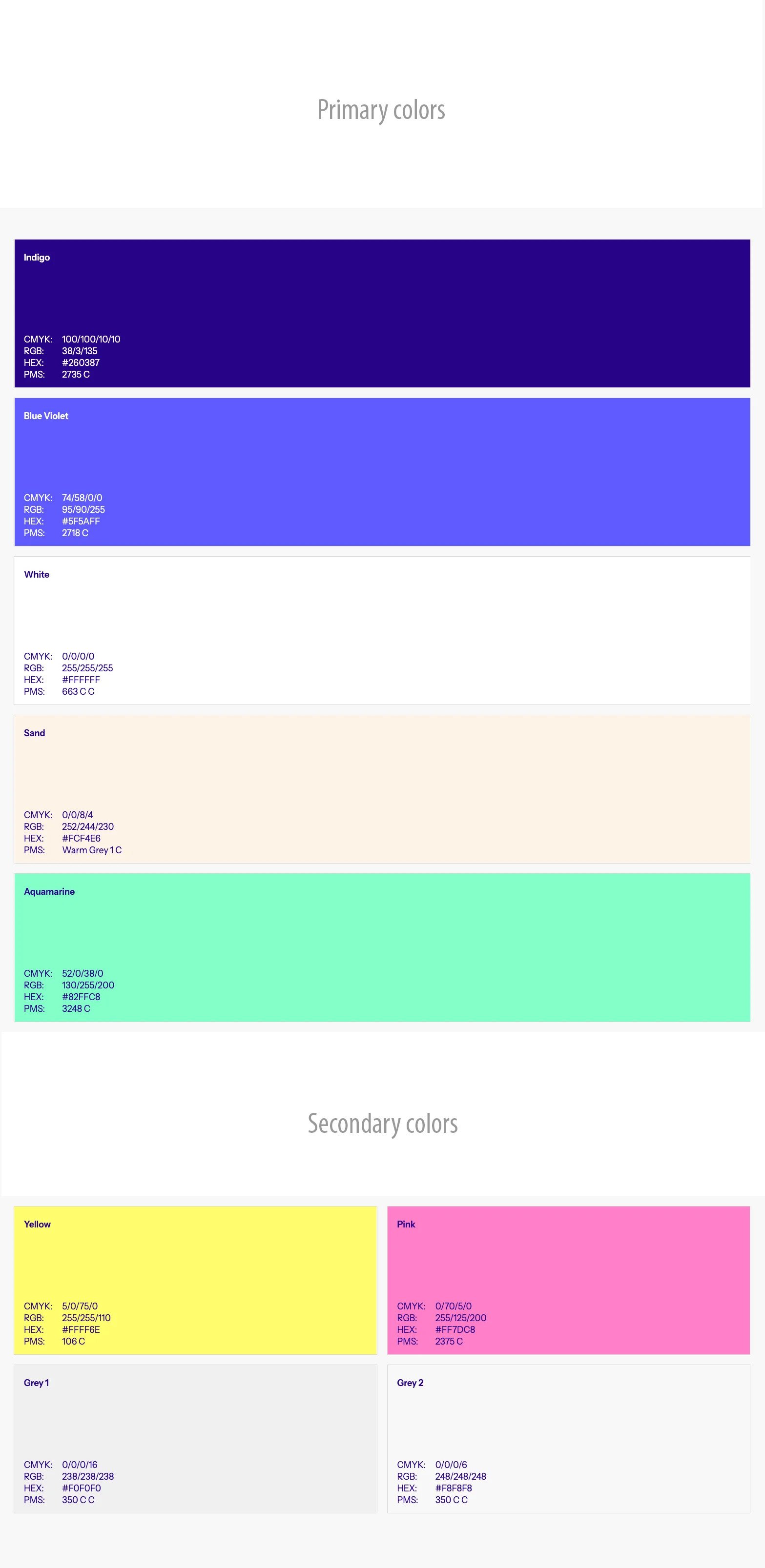
The NeurotechEU visual identity is designed to spark curiosity and reflection. At its core is a logo inspired by the intricate network of neurons and optical illusions, subtly incorporating a hidden “n” to challenge the viewer’s perception. This shape forms a unified symbol alongside a clean wordmark for optimal legibility, reflecting the collaborative nature of our alliance. The vibrant color palette draws from colorful CT scan imagery, giving the identity a modern, energetic feel that resonates with both neuroscience and EU visual language.
The NeurotechEU brand identity and logo were developed by Kolofon (https://kolofon.is/), reflecting a cohesive visual language and a strong, contemporary design aligned with the alliance’s mission and values.
The items such as logos, power point templates and word templates that can be downloaded without Sharepoint access, can be found under Resources. For further support on dissemination of activities visit the Forum (behind login).